
How to Think in Black and White Before You Take the Photograph
Learn how to see light, tone, contrast, texture and emotion before shooting. A practical guide to stronger black and white photography.
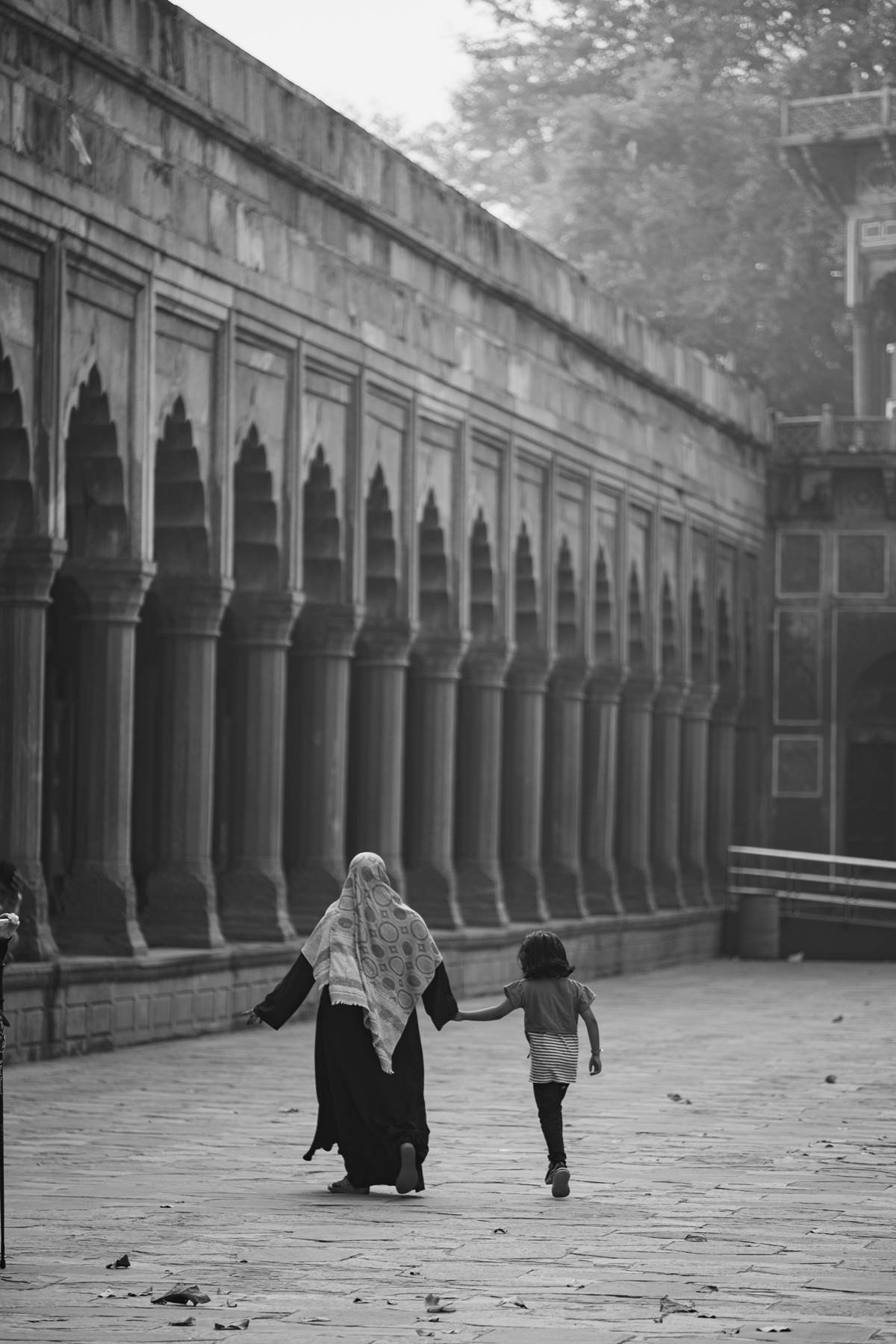
Many photographers decide that an image should be black and white only after the colour version feels disappointing. That approach can occasionally rescue a frame, but it rarely produces memorable monochrome photography. Strong black and white photographs usually begin earlier, with an awareness of light, tone, shape, texture and gesture before the shutter is pressed.
Learning how to think in black and white does not mean pretending colour is absent. It means predicting how different colours will translate into shades of grey, then deciding whether that translation strengthens the story. This practical black and white photography guide explains how to recognise a promising scene, choose useful camera settings, compose with tonal contrast and edit without turning every photograph into a hard, dramatic cliché.
Ask what black and white will reveal
Before taking the photograph, name the reason for removing colour. Perhaps a gesture is being lost inside a busy background. Perhaps side light is drawing a clear shape across a face. Perhaps texture, repetition or distance matters more than hue. If you cannot name what monochrome adds, the scene may be stronger in colour. Black and white photography is a visual decision, not a sign that a photograph is automatically serious, artistic or timeless.
Try looking at the scene in terms of relationships. Which area is brightest? Where does the deepest shadow begin? Does the subject separate from the background, or will both become a similar grey? A red shirt and green wall may look different to the eye yet translate into almost identical tones. Move the subject, change your position or wait for the light to change before relying on editing software to create separation later.
Learn to see tone instead of colour
Tone describes how light or dark something appears. A useful black and white composition normally contains a deliberate arrangement of tones, though it does not need pure black and pure white. Soft grey light can create a quiet portrait; hard sunlight can turn a street into blocks of brightness and shadow. What matters is whether the tonal structure guides the viewer toward the subject and supports the feeling of the scene.
Use your camera’s monochrome preview if it helps you learn. On a mirrorless camera, a black and white viewfinder or screen can show tonal relationships while the camera still records a RAW file containing colour information. If your camera has no electronic preview, briefly photograph the scene and review a monochrome JPEG. Treat the preview as a training tool, not as a final answer. Your eyes will gradually begin to anticipate the conversion without it.
Use light and shadow as part of the story
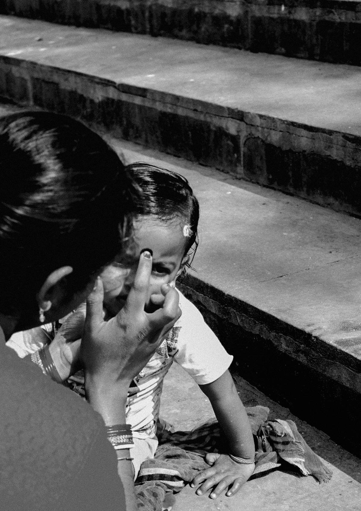
Light creates the hierarchy of a monochrome photograph. A bright face in a dark room attracts attention; a silhouette against pale mist becomes a shape before it becomes a person. Watch how window light falls across skin, how reflected light opens a shadow and how midday sun divides a wall. Black and white street photography often succeeds when the photographer waits for a person or gesture to enter an existing pattern of light.
Do not assume that more contrast means more emotion. If every shadow is crushed, contextual details may disappear. If every highlight is brightened, the eye has nowhere to rest. Expose to protect the information the story needs. Check the histogram when the light is difficult, and consider a small amount of negative exposure compensation when important highlights are close to clipping. The goal is usable tonal information, not a technically perfect graph.
Build the composition with shape, texture and space
When colour no longer separates objects, shape becomes more visible. Look for a clean outline, a repeated curve, a hand against a plain surface or a figure framed by a doorway. Negative space can give a portrait room to breathe. Layers can give documentary and street photography depth, but only when the tones keep those layers legible. Change your height and distance until the important edges stop colliding.
Texture is powerful in monochrome because differences in surface respond clearly to directional light. Weathered skin, fabric, stone, rain and smoke can all become prominent. Use that prominence carefully. Texture should contribute to the person or place being represented, not reduce someone to age, hardship or visual roughness. A black and white portrait remains a meeting with a person, not an exercise in collecting dramatic faces.
Choose camera settings that preserve intention
There is no single best setting for black and white photography. Use shutter speed to decide whether movement should be held or allowed to blur. Use aperture to control how much context remains visible. Use ISO to work with the available light while recognising that digital noise and film grain are not the same thing. For a moving street scene, shutter priority or manual exposure with Auto ISO can help protect the moment. For a quiet portrait, aperture and focus placement may matter more.
Photograph in RAW when possible. A RAW file gives you more control over how reds, yellows, greens and blues translate into grey during black and white editing. RAW also preserves more highlight and shadow information than a finished JPEG. You can still record RAW plus JPEG and use a monochrome picture style for the preview. This gives you the immediate black and white view without permanently discarding colour data.
Edit for meaning, not for a monochrome effect
Begin the edit by comparing the colour and black and white versions. Ask what information vanished and what became clearer. Adjust the colour channels carefully to separate important tones. Then work with exposure, contrast, curves, dodging and burning in small steps. Heavy clarity, artificial grain and deep vignettes may create instant drama, but they can overpower expression and make unrelated images look identical.
The final test is simple: does black and white help the viewer understand where to look and why the moment matters? Review the photograph beside other images in the series. A single monochrome frame inside a colour story can suggest another time or reality, even when that was not your intention. Consistency should serve the narrative. It should not become a rule that prevents a necessary colour photograph from remaining in colour.
A practical exercise for seeing in monochrome
Choose one familiar place and photograph it for thirty minutes using a monochrome preview. Make one image led by light, one by shape, one by texture, one by gesture and one by negative space. Avoid converting weak colour photographs simply to complete the set. Return home, compare the RAW colour files with the black and white previews, and write one sentence about what each conversion gained or lost.
Repeat the exercise in soft light and hard light. Over time, you will stop asking whether a photograph looks attractive in black and white and begin asking whether it was seen in black and white. That change is the foundation of intentional monochrome photography.
Further reading
These editorial sources informed the practical guidance in this article.