
Black and White Photography and the Things Color Hides
Why choose black and white photography? Explore tone, texture, attention and what monochrome can reveal or conceal in a photographic story.
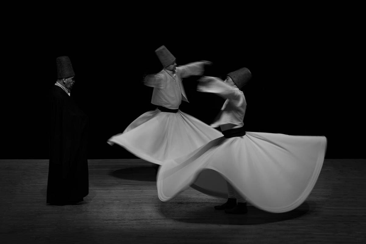
Remove colour from a photograph and you do not remove meaning. You rearrange it. A red coat and a green wall may become nearly the same grey; a pale sleeve against a dark room may suddenly command the whole frame. Black and white photography asks the viewer to follow light, texture and distance in a different way. It also asks the photographer to consider what the lost colour once told us.
In Neslihan Bilge Aytan’s image of a whirling performance, pale fabric moves through a dark space. The eye follows the shapes of the figures before it begins to study the floor and background. The photograph offers a lesson in visual structure, but it is not proof that monochrome is always more truthful, timeless or emotional. Those are effects an editor might feel, not facts a photograph can certify.
Think in tones before you think in filters
A black and white image is built from differences in brightness. If a subject and its background are similar in tone, they can merge even when their colours looked distinct. If light catches a hand, a doorway or the edge of a face, it can make a path for the eye. Adobe’s guidance on monochrome photography describes contrast, texture and composition as central choices. None needs to be pushed to an extreme: soft greys can carry as much feeling as hard black and white.
A useful exercise is to photograph one scene in colour and make a monochrome version afterward. Before deciding which you prefer, ask what disappears. Did colour identify a uniform, a warning sign, a season or a cultural detail? Did the new tonal relationships make an overlooked gesture visible? The right version is the one that tells the story you can stand behind.
A portrait is more than its texture
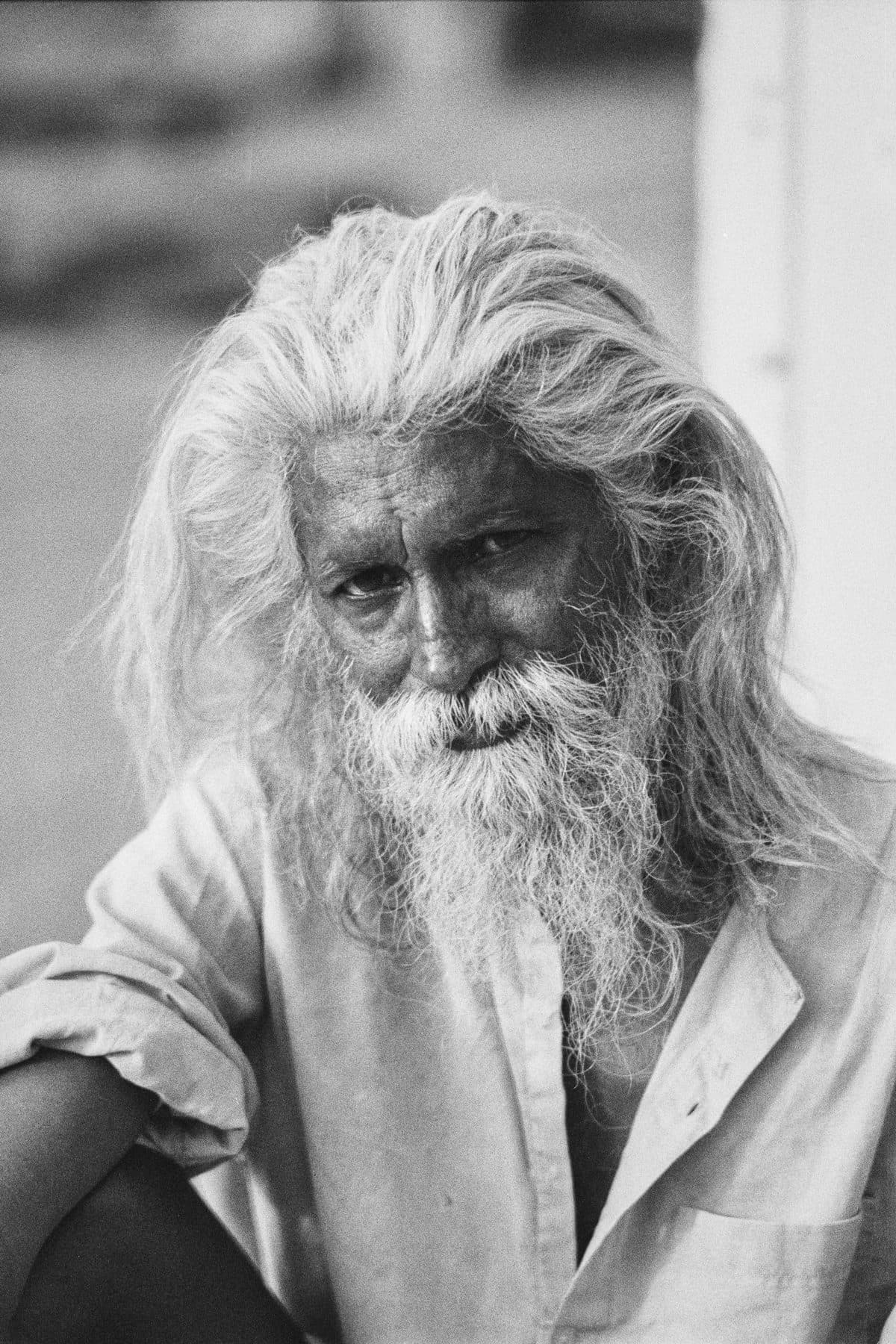
Victor Shohet’s portrait draws attention to hair, beard and gaze. The lighter tones around the face separate it from the background, and the grain remains part of the photograph’s surface. We can describe those visible choices. We should not use them to invent the sitter’s history or turn age into a ready-made symbol of wisdom. Black and white can make a portrait feel intimate; it cannot tell us who a person is without context.
That distinction matters when a photograph is shared far from the place where it was made. A caption should offer verified information and credit rather than relying on phrases such as “a timeless face.” If the person’s name or circumstances are unknown, say what is known and leave the rest open. The absence of colour must not become an excuse for the absence of care.
Do not confuse an old look with an old truth
Monochrome can suggest history even when the image was made yesterday. It can also make places appear detached from the present, particularly when the subject is a community unfamiliar to the viewer. That feeling may be useful in an artwork, but an editorial photograph needs its date and context. An aesthetic decision should never quietly become a false claim about the world.
Editing choices deserve the same scrutiny. Crushing shadows can hide people or objects that change the reading of a scene. Lifting every shadow can flatten the atmosphere you experienced. Compare the edit with the original and ask whether an important relationship has vanished. Monochrome is a translation, and every translation leaves something behind.
Choose black and white for a reason you can name
Before publishing, try describing the choice without using “classic” or “dramatic.” Perhaps the image becomes easier to read because the gesture and the architecture now share a rhythm. Perhaps a series made across different light conditions gains coherence. Perhaps colour was vital, and you decide to keep it. The exercise makes taste more deliberate rather than prescribing one correct answer.
When several pictures belong to one story, compare them as a sequence. A sudden switch from colour to monochrome can mark a shift in time or perspective, but it may also imply a distinction you never intended. Ask what the reader will infer. The strongest black and white photograph is not one that merely looks serious. It is one whose choices help us see more, while staying honest about what we still cannot know.
Further reading
These editorial sources informed the practical guidance in this article.